Creating an online course doesn't have to feel like assembling a 5,000-piece puzzle in the dark. Whether you are training employees on "New Safety Protocols" or teaching a masterclass on "Digital Marketing," the secret lies in a structured workflow.
We’ve all experienced the dreaded “Next, Next, Finish” style of online training. You know the ones endless walls of text, uninspired layouts, and an interface that feels like it was built in the early 2000s.
But what if you need to build something that actually captivates your team? Imagine you’ve been tasked with creating your company’s new onboarding course: “Sustainability in the Modern Workplace.” This isn’t just a compliance check; it’s a culture shift. You need it to look professional, be interactive, and work flawlessly on any device.
The good news? You don’t need a degree in web design to pull this off. Let’s walk through how you can use MentorKit Creator to bring this vision to life, piece by piece.
Starting with a solid foundation
Every great project begins with a clear vision and a structured outline. Before we worry about colors and images, we need to lay down the tracks.
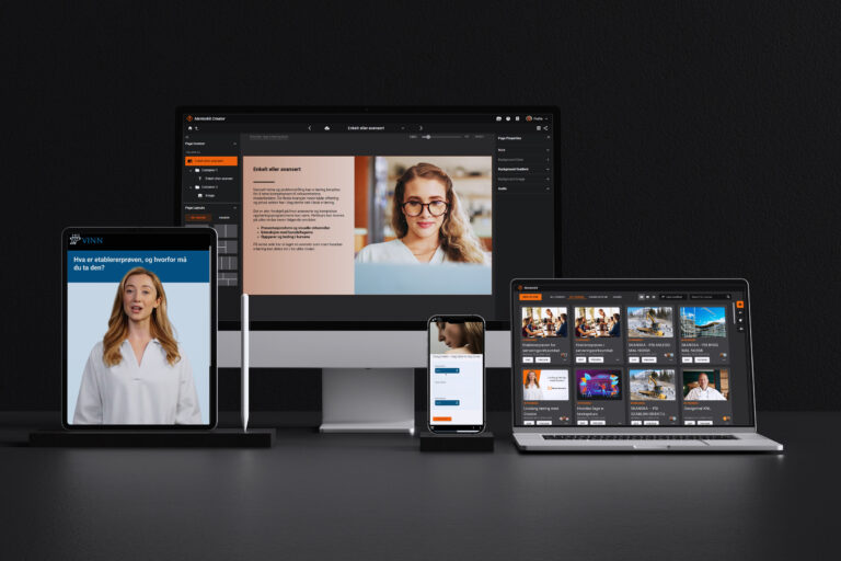
When you first open the creator, your dashboard is your command center. Creating the actual course shell takes seconds. You simply give it a strong title—like Sustainability 101—and a brief description so your learners know exactly what they are diving into.
Watch how simple it is to initiate your very first course from the main dashboard.
Once your course is created, the real magic happens in the structuring phase. A course is essentially a digital book, and a good book needs chapters. Instead of throwing all your content onto one massive page, MentorKit allows you to create individual pages for topics like “Energy Efficiency,” “Waste Management,” and “Green Commuting.”
The best part is how visually intuitive this is. By simply dragging a page slightly to the right beneath another, you instantly create a nested chapter. This makes navigating your complex sustainability course a breeze for your employees.
See how drag-and-drop functionality lets you effortlessly reorganize pages and build clear chapter hierarchies.
Bringing Your Knowledge to Life
With the structure in place, it’s time to bring in the content. Chances are, you already have your training materials sitting in a Word document or a PDF.
The text editor in MentorKit is built to be smart. You can drag and drop text straight from your browser or document directly into your course. If you’re pulling in data about global recycling rates from Wikipedia, you can easily insert hyperlinks, bold key statistics, and use rich formatting.
A pro tip for course creators: If you are copying from a heavily formatted Word document, use the “Paste unformatted” shortcut to ensure your course text remains clean and consistent with your chosen design.
Discover how to efficiently pull in external text, apply rich formatting, and manage tables and hyperlinks.
Designing for Impact: The Grid System
Now we transition from writers to designers. A modern course shouldn’t just be text; it needs layout variety to keep the brain engaged. MentorKit uses “Containers”—flexible boxes that hold your text, images, and interactive elements.
By default, a page might start with one large container, but you can easily choose layouts with two, three, or even four columns. For our sustainability course, you might want a two-column split: a compelling introductory text on the left, and a striking image of a wind farm on the right.
Learn how to select page layouts and populate flexible containers with your content.
But what happens when you change your mind? Let’s say you’ve designed a beautiful page, but you realize the image would actually look much better on the left side to guide the reader’s eye. Instead of deleting your hard work and starting over, you can simply use the “Swap” feature to instantly trade places between containers.
Watch the “Swap With” tool in action, allowing you to instantly redesign your layout without losing content.
To make these containers pop, you have complete control over their properties. You can adjust the padding (the breathing room inside the box) to ensure your text isn’t touching the edges. You can also apply solid background colors or sleek gradients. A subtle green-to-blue gradient behind your “Recycling Tips” container can subconsciously reinforce the environmental theme of your course.
Dive deep into fine-tuning container aesthetics, from adjusting padding to creating custom background gradients.
Engaging the Senses: Visuals and Interactivity
A picture is worth a thousand words, especially in e-learning. To make your course visually stunning, you don’t even need to leave the platform. MentorKit integrates directly with Unsplash, giving you access to millions of high-resolution, royalty-free images.
Whether you are looking for a bustling cityscape or a quiet forest, you can drop it right into your background. Crucially, the platform allows you to set a “Focus Point” on the image. This guarantees that if the screen shrinks, the most important part of your photo (like the Eiffel Tower or a person’s face) remains perfectly framed.
Explore how to integrate Unsplash graphics, manage image transparency, and utilize the crucial Focus Point tool.
Of course, sometimes you have too much information for one screen. If you have a list of “The 5 Pillars of Corporate Sustainability,” putting all that text on a single page will overwhelm your learners.
Enter the Accordion. This interactive tool lets you stack information into neat, clickable tabs. Learners can click on “Pillar 1” to expand the text and an accompanying image, then collapse it when they are done. It transforms a static reading assignment into an interactive discovery process. You can fully customize the colors, the border radius (rounded corners look incredibly modern!), and the gap between tabs.
See how to build interactive, space-saving accordions to present deep data cleanly.
The Final Polish: Ensuring a Flawless Mobile Experience
You’ve built a masterpiece. The text is sharp, the layout is balanced, and the visuals are stunning. But here is the reality of modern corporate training: half of your employees will probably take this course on their smartphones during their commute.
If your beautiful four-column layout shrinks down into unreadable, microscopic text on an iPhone, you’ve lost your audience.
This is where responsive design saves the day. You don’t need to build a separate mobile version of your course. By using the built-in preview tool, you can simulate smaller screens. Watch as MentorKit automatically detects the screen width and intelligently stacks your side-by-side containers vertically. Your image that was on the right now sits perfectly below the text, ensuring a frictionless learning experience on any device.
Watch the magic of responsive design as containers automatically stack and resize to fit any screen seamlessly.
Your Turn to Create
Building an impactful course is no longer about wrestling with clunky software; it’s about telling a compelling story. With these tools at your fingertips, your “Sustainability in the Modern Workplace” course is ready to inspire your team.
Other Tips and Tricks
-
LearnDash vs MentorKit Pro: Which LMS Is the Better Fit for Modern WordPress Learning?
Choosing the right WordPress LMS depends on how you want to create learning content, manage learners, and scale your training environment over time. Both LearnDash and MentorKit Pro support online courses, ecommerce, and learner management, but they are built around very different workflows.
-
How to sell courses online: a step by step guide
A Step-by-Step Guide Ready to monetize your expertise? This guide walks you through setting up an online course storefront using an LMS platform and e-commerce tools. From pricing your course to integrating with WooCommerce and marketing your offering, learn the keys to building a successful course business.
-
5 Tips to create engaging online courses
5 Tips to Create Engaging Online Courses Make your digital training stand out! Learn how to use multimedia, interactivity, and storytelling to design courses that captivate learners from start to finish. We share practical techniques (tested in MentorKit Creator) to boost engagement and knowledge retention.